Suppose your website have too much information to read, your customer will feel confused and irritated as they will not be able to search a piece of specific information. In this situation, the search button plays an important role.
The search button is the perfect navigation tool that improves the searching experience of your customers. But designing a website search bar can be a difficult job.
So you should learn a few steps for creating a site search for your stunning website. You can also use search plugins for WordPress also to designing a website search.
Table of Contents
Best Practices for Design a Website Search
1. Create a long search bar
You should try to create a long search bar on your website because it is a good option for your users.
When your user writes some questions on the search bar they should be able to check what they are writing and should be able to correct the question if it is wrong.
You can avail text box that accepts atleast 27 characters because most of the questions average length are 27 characters.
You can specify the width of the search bar by specifying the letter m, or with the help of ems. These letters will define the space in an effective way.
If you dont want to specify any size or space then you can make use of a simple search box that will raise as you type.
2. Use Auto-suggestions

The auto-suggestion will work as per user input. Actually most of the users are confused.
They don’t know how to ask questions, they are unaware of which keywords should be mentioned to find appropriate answers plus some users are not able to re-frame the question seen if they do not find the answer in the previous question.
These types of problems can be solved by using auto-suggestion in the search box. When you use auto-suggestion then try to give suggestions with the keyword option. Plus you can add some predictive text and questions that are commonly asked.
Auto-suggestion should be always there for correcting the spelling mistakes. Designing a website search will be very helpful for the users to get the desired result in less time.
3. Provide some options
Providing some options is the best design website search option because the user will feel good while searching. For example, you can ask a question to select the cities from a drop-down list, select depart and return date, etc.
The user will be able to select the options with the help of a mouse or keyboard keys. Plus you can provide one option i.e. bottom to up option to get your reach top of the page without scrolling via mouse.
Some useful suggestions can be provided by adding some creative fonts. This will make an easy task.
4. The search bar should be fixed for every page
The search bar should be contacted on every page of your website because it will maintain the effectiveness of your website. Hence your customer will be able to navigate easily from one page to the other.
For example, if your customer got landed on the incorrect page that this time he will look for the search bar.
If the search bar is common for all pages then they will be able to land on the correct page else they will be wasting time on finding search bar, at last, they will get irritated and will leave your website sooner.
If your website is linked to the dead link then the 404 error page should have occurred else your customer will get confused.
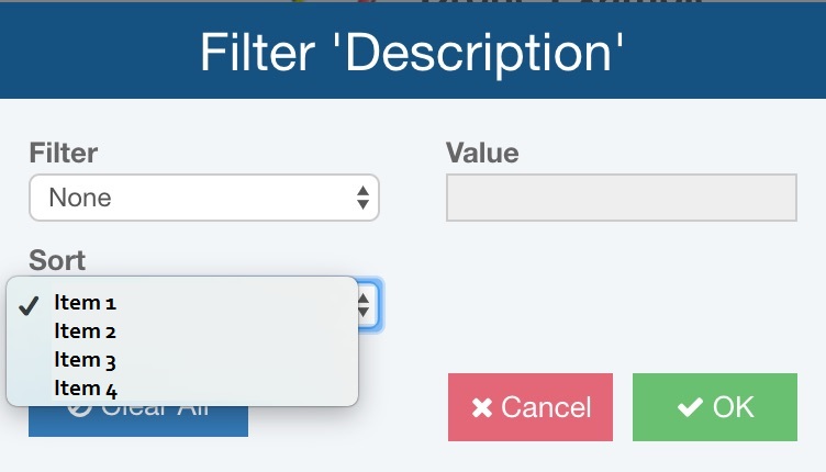
5. Add sort and filter option

Some largest shopping website such as Flipkart, club factory, amazon, etc has a wide range of option that makes thousands of products available for you.
They try to provide the best shopping experience for a child, adults, old age person, etc. They give you a filter option where you can filter some categories and searches only the stuff that you are looking for.
The shopping page gets appeared that is customized as per customer choice.
Make sure that the option should not be more than 7 in filtering because our memory can not remember filters more than 7.
But still, if you want more than 7 filters then you can combine all options in a single filter that is “view all filter” now you can insert the options as per the user option priority.
The sorting logic should be simple and clear so that your customers can sort their options as they need.
6. Add submit button
As Google performs searches for your answers, in the same way search bar performs searches for your answers on the website. Therefore every website should have a submit button as Google has.
So that your user can enter their queries or questions. The area for entering query should not be small especially on mobile phones and tablets the search query area should be larger.
The search button should be big so that your customers can find it easily and can access it without any problem. Enter buttons play an important role in providing correct answers to user’s questions.
7. Have a notable search bar
Make sure that you have designing a website search bar that is effective so that, you can find whatever you want very easily.
When the user feels confused they should be able to find a search box to find the solutions. You should make a search bar visible by showing the text field ans search icon on the website.
Many website designers face many problems while deciding the best position to place the search bar. The top of the header and top center is considered to be a perfect position for gaining more attention from many users.
YouTube users a top corner whereas travel agency uses top center corner because of its main focus searches.
8. Make use of Magnifying glass icon
Images and icons are considered to be the most effective presentation that drives user attention and makes your website more attractive.
If you want that the search bar should be visible by every customer then you should insert small search magnifying glass icon on the right hand side of the search box.
The size of magnifying glass icon should be same as size of search bar so that you website design will look neat and clean.