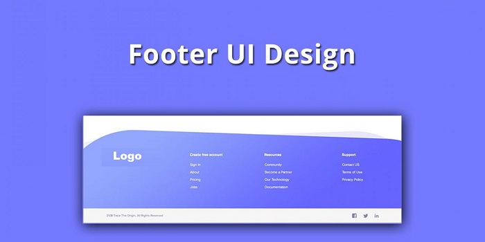
The most important part of your business website is a footer area. The footer area does not consist of too much designs or does not have any multimedia content but the value of the footer section is more than any other area.
Because most of the website continuously look for the contact details in the footer section only. Therefore it is necessary, not to ignore the footer area while design a website footer.
Customers usually come to the footer section of a website so that they can get in touch with you and find some important information related to your brand such as relevant sources, disclaimers, copyrights, social media links, etc.
Plus footer in the footer is considered as the most consistency section because each and every website has a footer section at the bottom of the page.
While design a website footer, web designers should concentrate properly so that they permit users to make interaction with the website easily.
Plus do not forget to include the call to action, address, maps, location, contact form, social media icons, sign-up form, registration form, and other navigation buttons.
But just integrating all this stuff to your website footer is not much effective because your main aim should be to create useful footer so that more customers can find all things in one place. In the simple footer is a short preview of your business homepage.
Table of Contents
8 tips are given below to design a website footer
1. Make it simple

Giving lots of important thing at a compact place can irritate or confuse users to navigate. But keeping the design simple will make a sense hence the user will able to navigate easily.
You should make use of elements in a proper way and space them effectively. You should never add such things that are useless and do not make sense.
Focus on footer size that how much information you are looking to add. Make sure to use color, text, and icons that are simple but look more elegant. Ensure that buttons and icons are redirecting to some active pages.
2. Customize it
Most of the website’s footer has two common things that are “Contact us” and “about us”. All customers visit the footer so that they can find something more informative about you like who you are and the contact details of yours.
Therefore contact information is vital because most of the customers misplace the business card and little difficult to manage it properly.
By adding contact details any customer can visit your website and contact you instantly. Contact details such as company address, location, contact number, email id, Google map should be always there.
And for “about us” you can include some company-related information such as current projects, goals, strategies, etc.
3. Include some information to the footer
While design a website footer, always group the links or information. Divide the information into categories by adding columns for services, contact numbers, social media, etc.
Try to specify heading for each section so that customers will be able to find accurate details. You can specify the details like “contact us”, “company”, etc.
Plus make sure to highlight the heading so it looks attractive. You can make use of icons for showing social media, email address, phone number, and skype.
4. Add action button

Once the customer entered your website homepage and navigating in the footer area you must provide something so that they can perform some action.
This will help you to engage more customers for a long time. For example, you can add some action buttons so that customers can subscribe to the newsletter.
Or you can avail them with your social media links to get connected socially. Moreover, assure that the action or navigation button is highlighted properly so that your customer will find it easily.
To get your customer attention you can highlight them with some fonts and colors. This will relay help you to get more sales in return.
5. Use more impressive graphics
People are unaware of the necessitous of graphics in the footer area. If you see maximum people neglect to include graphics in the footer that not make sense if you want more visitors and traffic.
Therefore you should always add some useful graphic elements or a logo in the footer area to get some value to your footer.
But make sure to not include so many things at a compact place. Try to include the details according to space availability. You can shorten details by integrating relevant icons for various activities.
By doing this your footer will have links and graphics that will not take much space. While designing a website sure that the size of icons is large so that the user can view it properly.
6. Include copyright

The simple text of copyright is very important and beneficial as it helps to gain more trust. You can redesign this section according to your theme. You can write “Copyright” or single alphabet i.e. “c”. Maximum people have included the copyright section on their website by including the copyright owner and the publication date.
Some websites are included with many copyrights that mean the website is designed by the third party. The copyright is usually shown in the footer on the right side. Plus do not highlight this section because your main focus is not copyright.
7. The content should be visible and readable
Footer has minimal space to integrate too much content so you have to list some important details, therefore, try to use proper colors, text, contrast and background element.
Every content should be readable. You can use typefaces such as sans serif with medium size is clearly visible. And for colors try to use a light color for background with black color text or vise verse.
8. Use hierarchy
The correct way to design a website footer section in attractive way is to use hierarchy. Place the important elements at the top and list rest below the main elements as per the given priority. This will allow your customer to know which links are important and what can be skipped.